%20(1).png?width=2701&height=607&name=BRC_NEXA_LOGO_BLACK%20%26%20VIOLET%20(1)%20(1).png "BRC_NEXA_LOGO_BLACK & VIOLET (1) (1)")
%20(1).png?width=2701&height=607&name=BRC_NEXA_LOGO_WHITE%20(2)%20(1).png "BRC_NEXA_LOGO_WHITE (2) (1)")
 Sam Keillor
 September 03, 2015
Ok what is “a responsive website”? If you don't know, don't feel bad, you’re not alone. After reading this blog you will know and understand the definition of a responsive website and why it’s important. Not only that but you can use your newly acquired knowledge to sound like a real smarty-pants at work. Responsive website design is simply a website design that adjusts easily to fit on desktop, tablet and smartphone browsers. Doesn't sound like such a big deal, right?
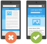 A responsive website keeps you engaged and makes websites easy to use, minus the ‘zoom in’ and ‘zoom out’ and trying to drag around the website in search of buttons and information. Removing these allows the website to look and feel good, regardless of which device the website has been accessed on, making it a much more user friendly experience.
If that’s not reason enough to convince you, here are 4 other reasons your website should be responsive:
MENA region growing rapidly
E commerce is growing rapidly within the MENA (Middle East and North Africa) region and consequently people spend a lot more time online so companies need to be aware of these trends. Business hubs such as Dubai, Abu Dhabi and Doha are at the forefront of this and have both high internet and mobile penetrations.
Revenue in the e-commerce market in the UAE is projected to reach US$5,321 million by the end of 2020 and is expected to show an annual growth of 16.2%, resulting in a project market volume of US$9, 700M BY 2024.
Mobile phone penetration
According to recent statistics, when it comes to device usage in the UAE, the greater percentage is reserved by the mobile phones with 99% usage where as laptop or desktop computers are reported with 71%.
Under the UAE digital media statistics, smartphone users in the UAE are highlighted with 96% usage while tablet devices are used across 28% in the UAE region.
With these stats in mind it is vital that your online presence is followed by a responsive website.
Bounce rates
Another fact for you, 27% of customers will leave a site if it is not mobile optimised. The bounce rate is measured by the amount of visitors that land on the website and then after a couple of seconds they either close the tab or click the “back” button. Don’t you just hate it when the website takes forever to load so you just click back and click on another link?
Competitive advantage
Currently within your industry where does your business stand? Are you forward thinking or are you playing catch up with your competitors? Keep up with the current trend - you don’t want your business to turn out like Nokia.
Nokia were once upon a time the leading mobile phone manufacturer but they did not keep up to date - they are still trying to play catch-up now! Some people don’t even know they exist anymore.
Don’t panic if your website isn’t responsive, it’s not too late to get it into tip top shape. Don’t forget your competitors are also noticing changing trends and are trying to get ahead with new technology, so you’ll want to stay ahead of the game.
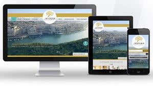
Since 2005, Nexa has been building websites for businesses around the globe and have a vast portfolio of clients, which include homegrown business to large global organisations. We will work with you to ensure your website is of the highest quality.
Interested in creating a responsive website? Click here for our website calculator.


Comments