When it comes to turning visitors into customers, your interface matters more than you think.
Every design decision affects whether they stay, click, or leave. A clean layout. A well-placed call to action. A colour that triggers trust. These features connect to how people process information and make decisions. UI design for conversion, UX and CRO strategies are built around this understanding.
In the digital world, attention is short, expectations are high, and patience is low. That’s where UX and UI come in.
In this blog, we break down the psychological principles behind high-performing websites and explore how NEXA helps brands harness UI design for conversion, UX, and CRO strategies that deliver consistent results.
What’s the Difference Between UX and UI?
- UX (User Experience) focuses on how users interact with your website or app. It includes usability, flow, ease of access, and overall satisfaction.
- UI (User Interface) is how your website looks. This includes layout, colours, fonts, icons, animations, and visual structure.
Think about your site as a store. UX is how easy it is to move through the store and find what you're looking for. UI is how clean and intuitive the signage and layout feel. Both affect what someone does next. At NEXA, we build UX and UI with one purpose: to improve conversions based on how people actually behave.
How Design Choices Influence Behaviour and CRO
Design that converts is grounded in psychology. Here are the principles we apply in our UX and UI strategies:
1. Cognitive Load
The more users need to think, the less likely they are to act. Cognitive load is one of the first things to reduce when designing for conversions. When your site is cluttered or forces people to think too hard, they’ll hesitate. You can reduce this by keeping menus simple, using clear headings, and maintaining consistent structure across pages.
Smart design reduces friction. Users should never feel lost or overwhelmed.
2. Fitts’s Law
You should also consider where people are likely to click. Fitts’s Law shows that the easier it is to reach and click an object, the faster the action.
This means:
- Buttons should be large enough to click easily
- CTAs should be placed where the eye naturally travels
- Primary actions must stand out
Keep your main buttons in clear, visible areas and test their size and spacing across devices.
3. Hick’s Law
Choice paralysis is another factor. Hick’s Law shows that too many options lead to inaction. If you’re offering five pricing tiers on the same screen or multiple actions in a header, you’re likely slowing down the user. Test versions with only two or three paths at a time.
Guide decisions by limiting visible options. Use progressive disclosure: only show what the user needs at that moment.
4. Visual Hierarchy
Visual hierarchy guides the eye. Most users scan first, then decide whether to read. Larger headings, consistent spacing, and careful placement of key content can direct attention more effectively than flashy design.
Use:
- Contrasting font sizes
- Clear headings
- White space
- Colour to draw attention
A strong visual hierarchy helps users move naturally towards conversion.
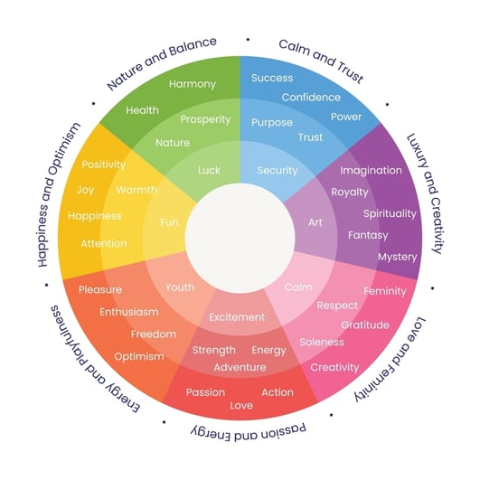
5. Colour Psychology
Even colour matters. If you want a user to feel safe, consider using blue tones. If you’re pushing urgency, try red. You should match colour schemes with your brand, but also test how those colours perform across different goals. Ask yourself: does your design create clarity or hesitation?
NEXA’s designers use colour intentionally to shape user perception.
6. Social Proof & Trust Signals
Trust signals are another way to influence action. Include clear testimonials, recognised payment icons, or visible SSL badges. People want to know they’re not the first to try what you’re offering. If you don’t show proof, you’re adding risk to their mental calculation.
Boost credibility with:
- Testimonials and reviews
- Trust badges (SSL, payment partners)
- Client logos
- Clear privacy statements
Every trust element plays a part in the decision-making process.
How NEXA Connects UX, UI and CRO Strategy
UX and CRO strategies overlap, and like UI design for conversion, they only work when backed by behavioural data. At NEXA, we audit your existing interface to see how users actually move through your site. This includes heatmaps, funnel analysis, scroll behaviour, and time on page.
Once you have the data, you can make targeted changes. This may include changing the order of elements, simplifying forms, or moving CTAs higher up the page. If your site asks too much too soon, users may not get far enough to convert. If your copy creates doubt, they won’t act.
We also test versions of pages side-by-side. This includes variations of CTA buttons, form lengths, headline structure, and even icon choices. The smallest differences can result in measurable shifts in engagement or revenue. Do you know which of your headlines converts best? Have you tested different placements of your lead form?
Real Examples: Smart UI Design at Work
Some of the most effective conversion designs are simple, fast, and clean.
Here are a few design features that consistently work across the industries we serve:
|
UI Element |
Why it Works |
|
Sticky CTA bar |
Keeps the main action always visible |
|
Progress bars on forms |
Reduces abandonment by setting clear expectations |
|
Hero images with direct value propositions |
Grabs attention immediately |
|
Click-to-scroll cues |
Guides users down the page instinctively |
|
One-column form fields |
Feels faster and easier to complete |
NEXA has implemented these with measurable success for e-commerce, real estate, SaaS, and education brands. Check portfolios
Mobile UX and CRO: Strategies You Can't Ignore
Over half of your users are visiting from a phone. If your mobile experience isn’t functional, your conversion strategy won’t perform. We design for mobile before desktop, not the other way around. This means testing how CTAs appear on smaller screens, using thumb-friendly layouts, and reducing content that doesn’t serve the core action.
Fast load times, simplified content stacking, and tap-friendly buttons all contribute to a smoother experience. You can’t assume users will zoom or rotate to read something.
Have you tested your full lead funnel on mobile recently, from ad click to confirmation message?
How Nexa Turns UX Into ROI
UX isn’t just a design task. It’s a revenue strategy. Every web project we deliver is designed around performance. That begins with a full review of how your current design is influencing user behaviour. We identify friction, simplify structure, and design around actual usage patterns. You receive not just a new layout, but a path to higher returns.
We approach every web project with this goal: create a user journey that ends in action.
Our full-stack service includes:
- UX audits and CRO consultations
- Custom UI design for every platform
- Web and app development
- Heatmap and behavioural tracking integrations
- HubSpot, GA4, and CRM alignment
Whether you’re launching a new brand or rebuilding an underperforming site, your user experience should lead somewhere. We help you get there.
Final Thought: Don’t Leave UX to Chance
What’s stopping your users from taking action at the moment? Is it clarity? Speed? Trust?
These questions have clear answers and they’re in your data. We help you turn that data into design, and that design into conversions through practical, psychology-led UX and CRO strategies.
Let’s talk about how we approach UI design for conversion. If you’re ready to upgrade your user experience and lift conversions, NEXA is your partner in smart, psychology-driven design.
Want to see what’s possible? Talk to our experts today.
